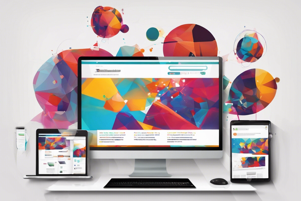
Why Responsive Web Design is Essential for Modern Websites in an Era of Diverse Device Usage
As the demand for seamless user experiences across devices continues to rise in today’s digital age, CVN-WebDev stands ready to address this critical need through our expertise in responsive design. With our team’s deep understanding of the importance of adaptable layouts and content presentation, we ensure that your website functions impeccably on every device, be it a smartphone, tablet, laptop, or desktop. By embracing responsive web design principles, we empower your website to dynamically adjust its appearance and functionality, delivering an optimal viewing experience to users regardless of their chosen device.
In an era where users interact with websites through an ever-expanding array of devices, the significance of responsive design cannot be overstated. At CVN-WebDev, we recognize the pivotal role that responsive web design plays in enhancing user engagement and satisfaction. Our tailored solutions not only guarantee a consistent and user-friendly experience across devices but also position your website for success in an increasingly competitive online landscape. By entrusting your project to CVN-WebDev, you’re investing in a partner dedicated to ensuring that your website remains accessible, engaging, and impactful across all platforms.
Enhanced User Experience
Increased Reach and Accessibility
Improved SEO Performance
Cost Efficiency
Future Proofing
Seamless Adaptation
How Responsive Web Design Elevates Engagement and Satisfaction Across Devices
Responsive design ensures that websites adapt seamlessly to the screen size and resolution of any device, providing users with a consistent and optimized browsing experience. This leads to higher user satisfaction and engagement, ultimately driving retention and conversion rates.
Consistent User Experience
Improved Accessibility
Enhanced Interaction and Conversion
Expanding Horizons
Unlocking Cross-Platform Accessibility to Engage Diverse Audiences
With the proliferation of smartphones, tablets, and other devices, responsive web design enables websites to reach a wider audience. By catering to users across various platforms, businesses can maximize their online presence and accessibility, regardless of the device their audience prefers.
Broadened Reach
Seamless User Experience
Enhanced Engagement and Interaction
Google's Preference
Maximizing Visibility and Traffic with Mobile-Friendly Websites
Responsive design is favored by search engines like Google because it delivers a better user experience and reduces the need for separate mobile and desktop versions of a website. Websites that are mobile-friendly tend to rank higher in search engine results pages (SERPs), leading to increased visibility and organic traffic.
Favorable Search Engine Rankings
Improved User Experience
Tap into Mobile Traffic
Cost-Efficient Solutions
Cutting Development Costs and Simplifying Maintenance Across Devices
Maintaining separate websites or mobile applications for different devices can be time-consuming and expensive. Responsive design streamlines the development and maintenance process by allowing one website to adapt to multiple devices, reducing both initial investment and ongoing operational costs.
Single Website Management
Reduced Development Time
Lower Operational Costs
Future-Proofing Your Website
Staying Ahead of Technological Advances with Adaptable Web Solutions
As new devices with varying screen sizes and resolutions continue to emerge, responsive design ensures that websites remain adaptable and functional across all platforms. By investing in responsive web design now, businesses can future-proof their online presence and stay ahead of evolving technological trends.
Future-Proofing Your Website
Embracing Innovation
Meeting User Expectations
Google officially announced in 2015 that mobile-friendliness is a ranking factor in search results
Websites that are mobile-friendly tend to rank higher in search engine results pages (SERPs), leading to increased visibility and organic traffic.
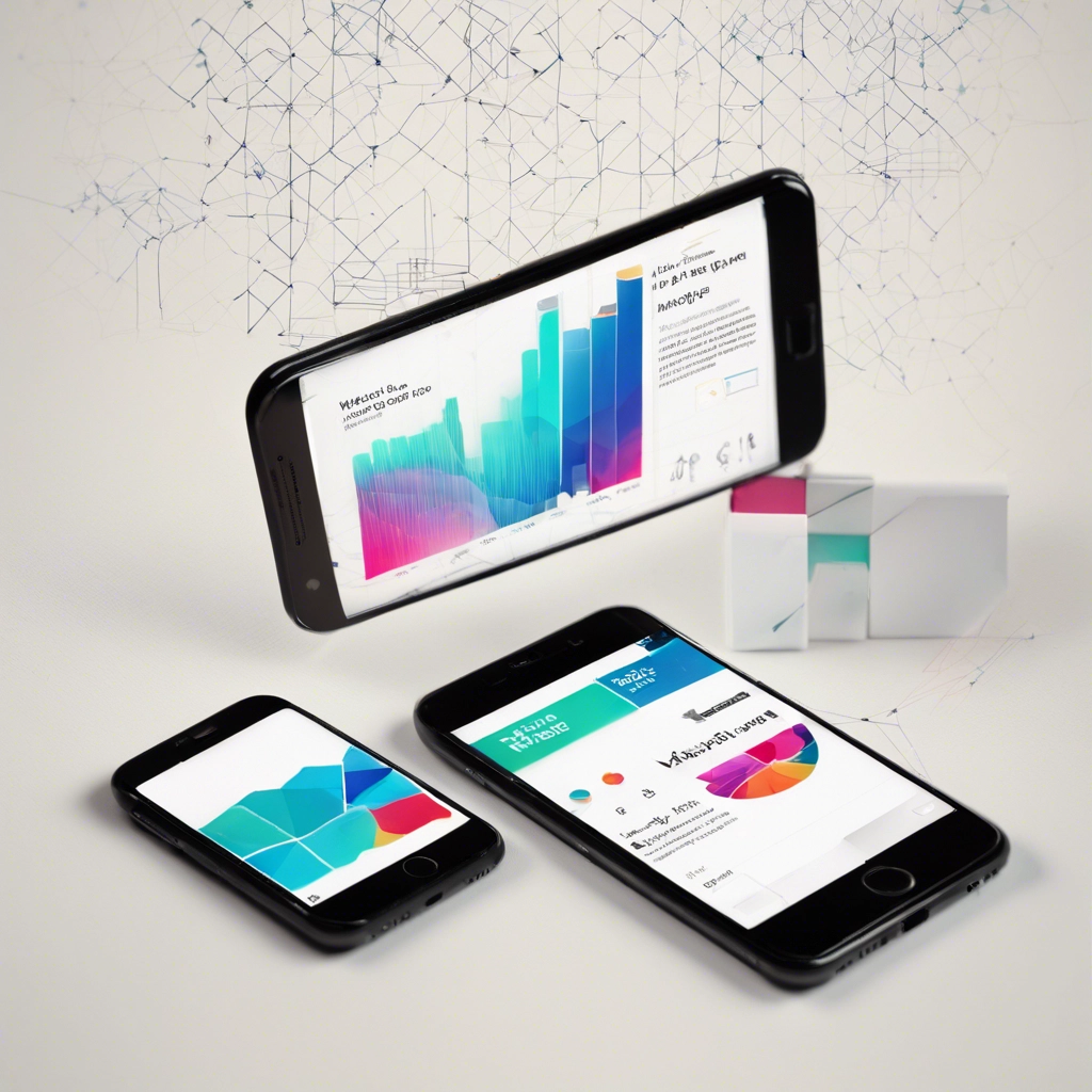
Meeting The Demands Of Mobile-First
Key Insights into the Impact of Mobile Traffic, User Experience, SEO, Conversion Rates, and Customer Expectations
In an era where mobile devices dominate online interactions, responsive web design emerges as a pivotal strategy for businesses aiming to thrive in the digital landscape. With mobile devices accounting for over 54% of global website traffic in 2021, as highlighted by Statista, the imperative to cater to mobile users is undeniable. Moreover, studies by Google underscore the critical role of responsive design in user engagement, with 61% of users unlikely to revisit websites that aren’t mobile-friendly. Beyond user experience, Google’s endorsement of mobile-friendliness as an SEO ranking factor further emphasizes the importance of responsive design in maximizing visibility and organic traffic. The impact extends to conversion rates, as Adobe reports a 10% increase for companies employing responsive web designs, attributing this rise to enhanced user experience and accessibility across devices. Additionally, customer expectations for consistent experiences across channels, as revealed by a Salesforce survey, reinforce the necessity for responsive design in delivering seamless interactions regardless of the device used, ultimately enhancing brand perception and customer satisfaction.
%
Mobile Traffic
%
Engagement
%
Expectations
Mobile Traffic Dominance
According to Statista, mobile devices accounted for over 54% of global website traffic in 2021, highlighting the significance of catering to mobile users through responsive web design.
User Experience Boosts Engagement
A study by Google found that 61% of users are unlikely to return to a website that isn't mobile-friendly, emphasizing the importance of responsive design in retaining visitors and fostering engagement.
Customer Expectations
A survey by Salesforce revealed that 76% of consumers expect companies to provide consistent experiences across channels, including websites accessed from various devices. Responsive web design addresses this expectation by delivering a seamless experience regardless of the device used, thereby enhancing brand perception and customer satisfaction.
Faqs
Asked Questions about Responsive Web Design
Responsive web design is an approach to web development that ensures a website's layout, content, and functionality adapt fluidly to accommodate various screen sizes and resolutions across devices, including smartphones, tablets, laptops, and desktops.
Responsive web design is crucial for providing a consistent and optimized browsing experience to users across different devices. It improves user experience, enhances engagement and satisfaction, boosts SEO performance, maximizes visibility and traffic, and ultimately leads to higher conversion rates and better customer retention.
Google officially announced in 2015 that mobile-friendliness is a ranking factor in search results. Websites that are mobile-friendly tend to rank higher in search engine results pages (SERPs), leading to increased visibility and organic traffic. Responsive design ensures a single URL and consistent content across all devices, which simplifies crawling and indexing for search engines.
The key principles of responsive web design include fluid grids, flexible images, and media queries. Fluid grids enable content to resize proportionally based on screen size, while flexible images and media ensure that visuals adapt seamlessly. Media queries allow developers to apply different CSS styles based on device characteristics, facilitating responsive layouts.


